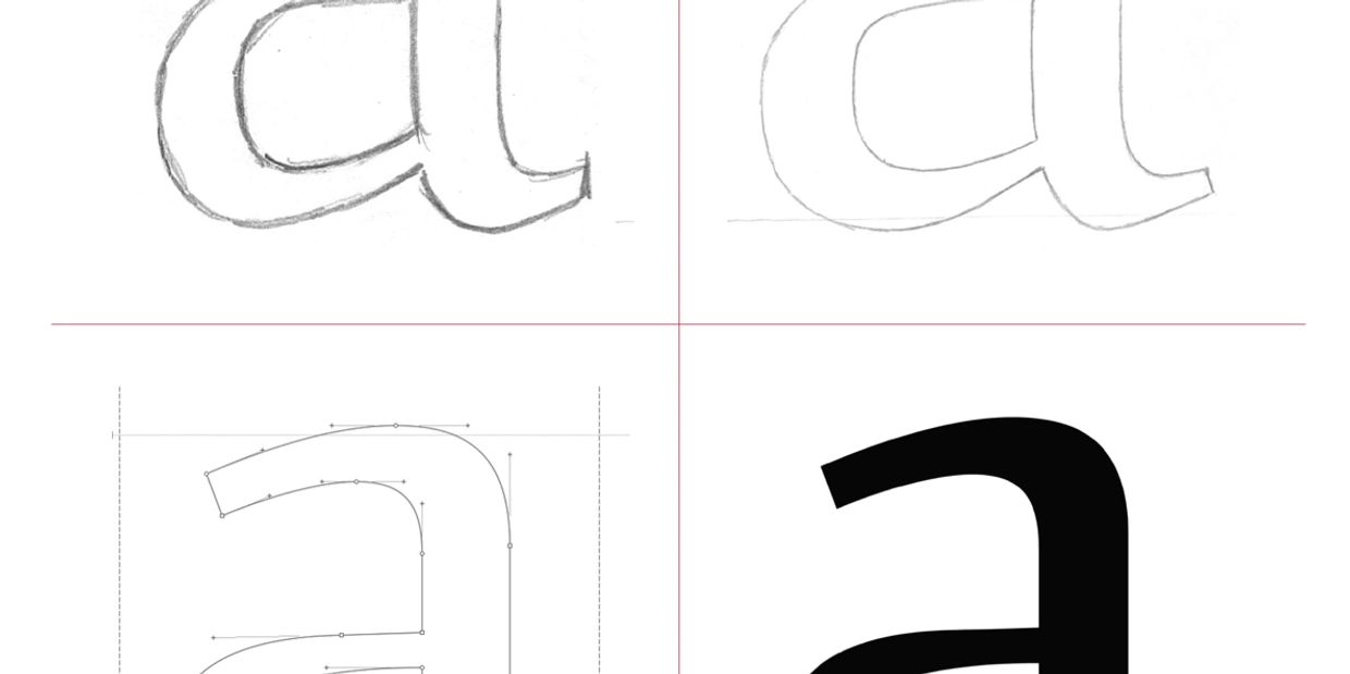
The Type Design Process
Pencil to Bezier – and Beyond
Type designers all have different approaches to design and often try different techniques depending on the style of typeface. Many work from pencil sketches and others might draw with a stylus on an iPad. For me – no matter how the initial idea came to be – I try to get the ideas in to the font tool called GlyphsApp as soon as I can. Glyphs is, hands down, the best tool ever created for making type.
Equally important to well-digitized letter shapes is the white space between them. As soon as a few characters are digitized in Glyphs I work to manage the non-black areas in context with each other. For example, a beautifully constructed ‘a’ might appear too cramped or narrow when compared to ‘o’ so proportions must be adjusted accordingly. Once they feel in harmony with each other there is the matter of the space between them.
There is often confusion between kerning and letter-fitting. Letter-fitting is the net effect of all the letters in context. Kerning is adjusting letter combinations which don’t conform to the basic straight and round-sided characters. The trick is making sure kerning doesn't disrupt the rhythm of the letter-fitting – that is – a kern of ‘A to V’ that is too tight or loose will look out of place when set next to ‘H and I’.
Additional kerning is commonly needed when typesetting a headline. This is the job of the typographer – not the type designer. It is almost always necessary to adjusting individual word shapes for a headline because individual words may have a unique rhythm than the alphabet as a whole. For example the name CHARLIE would likely need very little fine-tuning but the name AVERY would need more.
A type design is the aggregate of many dozens of small details. The final stage of a type design is often winnowing down a number of unique features which cause more distraction than distinction. An exuberant ‘ear’ of lowercase ‘g’ might be wonderful on its own but cause clashes or disharmony in the context of words. A small ‘counter’ on ‘e’ may look elegant at 100pt but cause problems at 10pt. These types of details must be considered carefully and will impact the success of a type design.
Stay tuned for more thoughts about the creative process!
Learn More
GlyphsApp.com is the home of the best type design tool ever made. Join the community there for amazing tool tutorials and support!