
NEWSFLASH! APTOS — NOW APPEARING IN YOUR MICROSOFT FONT MENU
1/3
About Me

Year 2 of Matteson Typographics!
Year 2 of Matteson Typographics!
Year 2 of Matteson Typographics!
It’s been a wonderful year – thank you all for your support! SO many great things to look forward to in year three.
I’ll be working on Custom typefaces as well as designing new licensable fonts. See the blog for updates!

Metal to Mobile
Year 2 of Matteson Typographics!
Year 2 of Matteson Typographics!
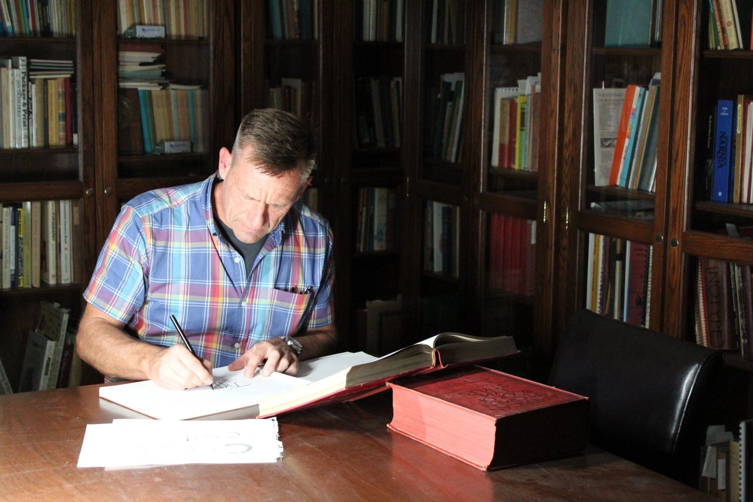
Trained as a letterpress printer I’ve used these roots to inform my work in evolving digital times.
My ambition in custom type design is to maintain legibility while capturing the unique tone of voice required by my clients.
I have designed or revived over 90 typeface families – nearly 30 of which are for corporate branding. For a showing of some of my retail typefaces click here.
GREATEST HITS
Year 2 of Matteson Typographics!
GREATEST HITS
Segoe and Aptos for Microsoft: Segoe, released in 2004, and the all-new Aptos, provide high legibility, approachability, and flexibility for all Microsoft® products.
Toyota Type: An ergonomic and robust family of fonts which allows Toyota to speak in multiple tones for its extensive brand and its Olympics sponsorships.
Open Sans: Originally designed for Google branding, Open Sans was later introduced to the Google Fonts directory. It is the foundation for Noto Sans, the most complete Unicode-encoded multilingual font solution ever created. For a serif companion try Open Serif.
Legibility Research: I have worked with MIT’s AgeLab in conducting ground-breaking research in quantifying what makes type legible. Read more here and here.
INTERVIEW IN BOULDER CO
A fun conversation with Jay Farracane on Caffeinated Mornings
Toyota’S Brand fonts
I’m particularly proud of the work I did with Saatchi & Saatchi on the Toyota brand
Video
Making Futura Now
In 2020 I art directed the reimagined Futura Now typeface family with the Monotype Studio
Typeface Legibility Study
In 2015 I initiated a study of the impacts of typefaces
on automobile interfaces